Principle Connect
User Experience
Overview
During my time working at Principle Global one of my jobs outside of Frontend Engineer was to consolidate the user experience for our suite of products. The project started as a mixture of designs that had been applied over the years to many different clients across our products. During this redesign, I had to come up with a design language that took all of these different environments into account while also offering branding options for our different clients. This allowed our users to feel comfortable in whichever product they were using without having to relearn the interface.
Color Palette
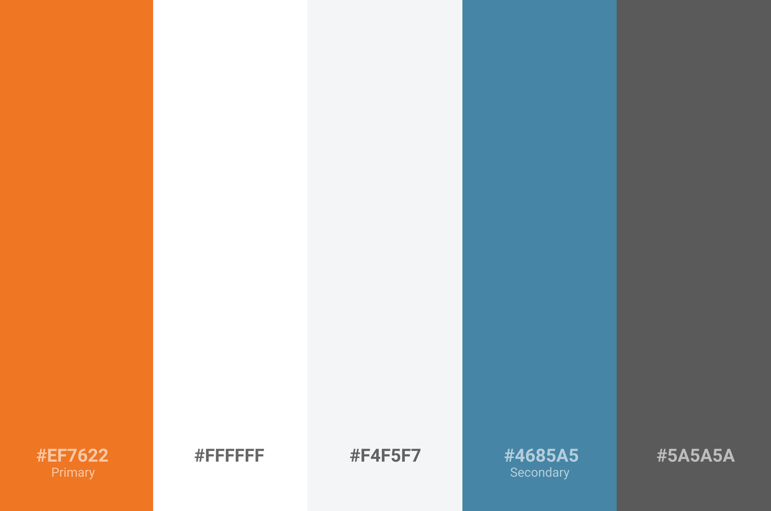
Colors play a crucial role in creating a consistent user experience. A simple and consistent color palette throughout your application creates an atmosphere your users will become familiar with. Your color palette shouldn’t be jarring but rather a subtle mixture of colors that create a relaxing tone.
Visual Hierarchy
Visual hierarchy refers to how items interact with each other on the z-axis. The amount of z layers visible on screen should always be kept at a minimum (ex: modals shouldn’t overlay modals).
Shadows
Shadows help relay a component’s z height in relationship to other components on the page. The use of shadows not only creates a stronger sense of where content is divided but also helps to indicate a stronger sense of hierarchy among the items on the page.
Opacity
The use of opacity can help draw the user’s eye away from content that they might not need to see at that exact moment. Opacity can be utilized to indicate when an element is inactive or to create hierarchy among smaller sub headings of text that isn’t as important as the main heading.
Layers
Layers can be used to dictate higher priority but should never overcrowd the application. Layers play hand in hand with shadows to help create diversity among the content of a page. Layers can be on the same plain of view as each other or can completely overlap other content in the instance of a modal or tooltip.
Buttons
Buttons are one of the most critical components to an application. Almost everything in your app from navigation to interaction is accomplished via some kind of button. In order to create a consistent user experience, you’ll want all of these actions to look familiar to your users. Not every button needs to look identical because this would be confusing for your user to identify priority among your actions, but all buttons should follow a consistent pattern.
Button States
There are 3 different button states that each play a different role. From left to right, there are resting, active, and disabled. Each of these states play a critical role in explaining the button’s action to the user. A resting state indicates a button that can be clicked but isn’t actively in focus by the user. An active button indicates which button is currently focused by the user either by hovering or when the user tabs to the button. A disabled state indicates that the button exists but isn’t currently able to be used because of an unmet prerequisite.
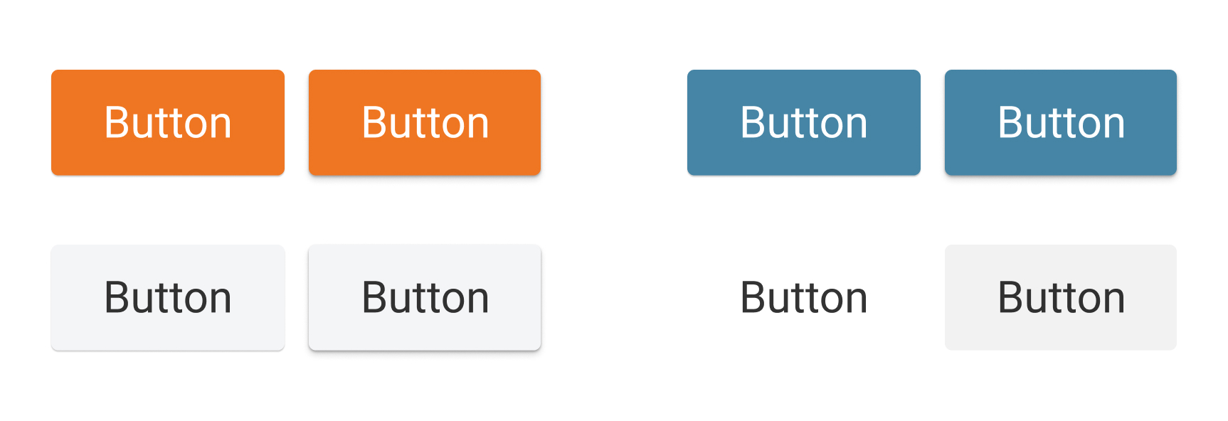
Button Hierarchy
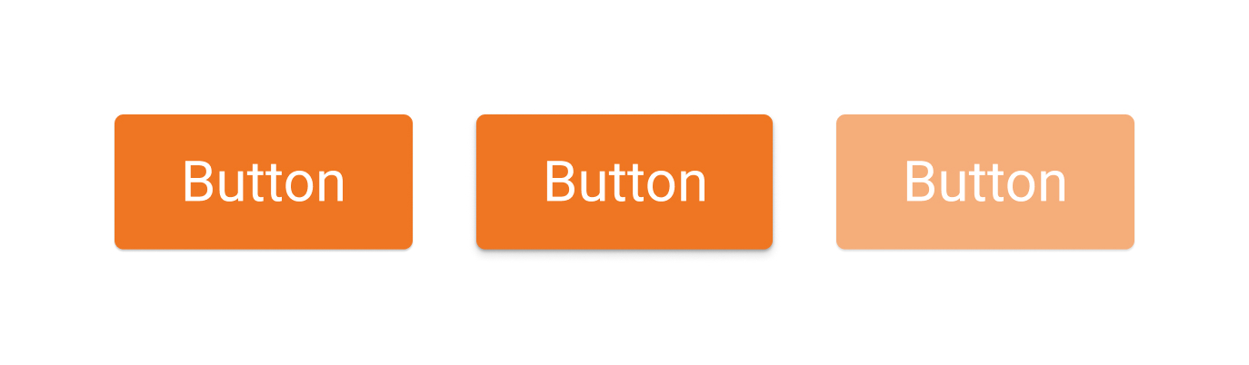
Button hierarchy plays an important role in defining the importance of the action the button represents. In the following image, there are 4 different button styles: Primary, Secondary, Tertiary, and Flat. The first 3 options have similar styles with only color differences while the fourth button is completely flat with no background until hovered. A primary button should represent a high priority action that should draw a user’s attention immediately such as a call to action to register for your product. A secondary button still has a high priority but shouldn’t draw more attention than the primary button. An example of a secondary button would be a call to action to sign in to a profile. A tertiary button follows along the example of the primary and secondary button, it’s an action with medium priority that shouldn’t visibly overpower the primary and secondary call to actions. A flat button should be of lowest hierarchical priority, such as a button to cancel out of a form or to delete a profile. This isn’t an action you want a user to do, but something they should have the ability to if needed.
Putting It All Together
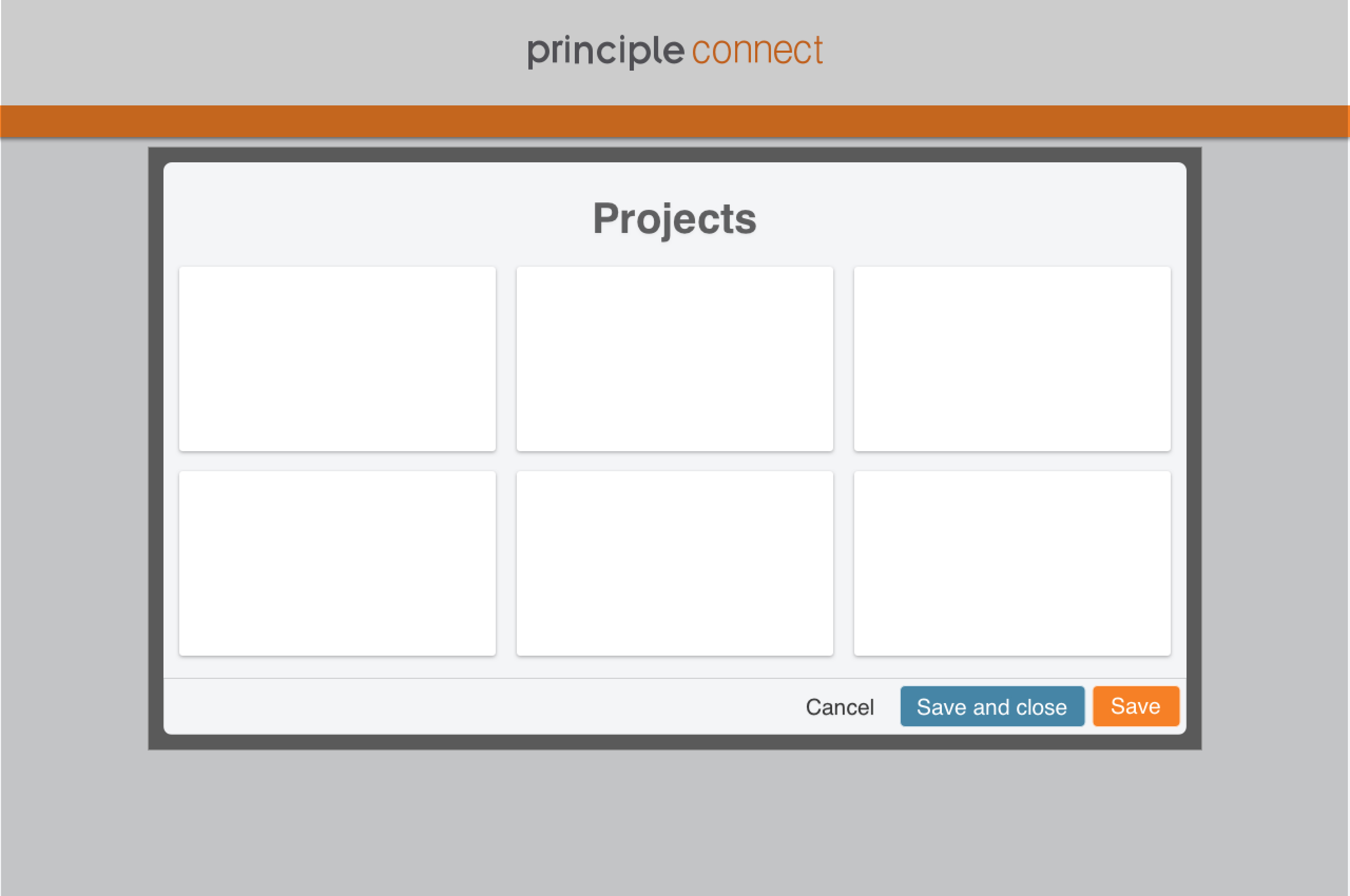
Now that we’ve visited the different principles of creating a cohesive user experience, it’s time to put it all together. In the following example, you can see the visual hierarchy of a modal overlapping background content. Inside this modal is content that has been given a shadow to raise it off the base z index of the modal to add a level of importance. At the bottom of the modal, a set of three buttons that follow the button hierarchy outline the actions the user can perform on this set of content that has been opened in the new modal.
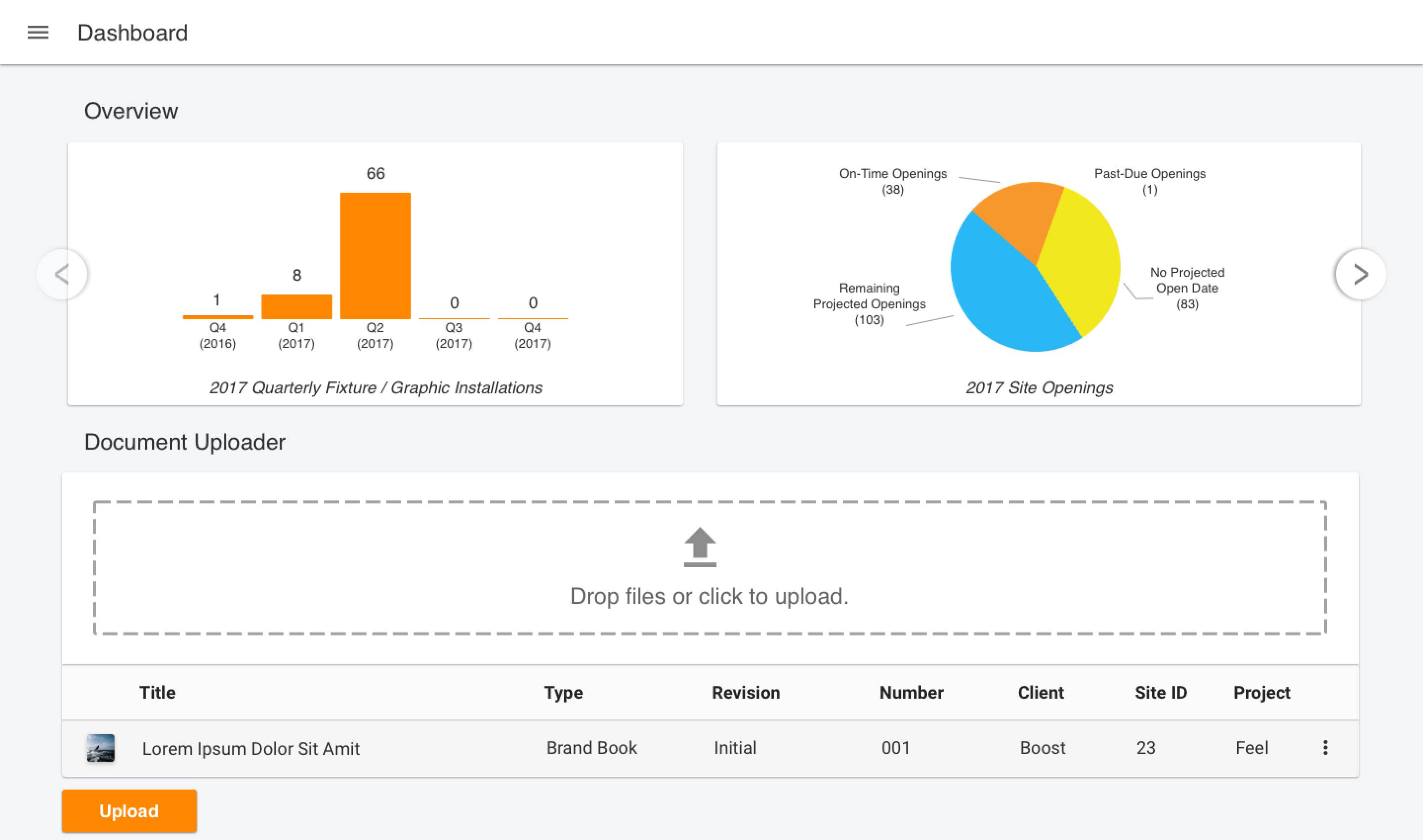
Another great example is the dashboard a user lands on whenever they first log into the app. Notice the different levels of hierarchy between the sections. The charts at the top are overlaid with buttons, one with a lower opacity showing no other options to the left and one enabled showing the ability to scroll right. In the table below the charts, notice the subtle use of shadows to differentiate the upload dropzone from the table heading and subsequently the table rows below. This allows the user to work their way down the visual hierarchy of the page while keeping track of where they are and what actions can be performed in each section.